Monday 22 October 2012

Concept Art: Silhouettes

Concept Art: Silhouettes

When doing concept art creating a character from scratch can be difficult and frustrating. But there are techniques that can help make your designs more accurate and varied. The best technique is silhouetting, silhouettes are a very good way of getting the shape for your character and finding out what sort of character it is. It's a very simple technique which is best used on Photoshop because you can quickly sketch out shapes and rub them out. After a few trys you can start to see a character forming and from there you can just let your imagination run free. A lot of professional concept artists use this technique's to quickly get a few basic character structures and then pick the one they like and start adding detail, they then would give the silhouette sketches to a designer or 3D artist to model off.
The silhouettes need to be very strong and varied because when playing a game you need to be able to kow what that character is when you first see it. It's useful, when designing silhouettes, to make more than one and make each one different in shape and value and from that you can combine them, for example; if you like the arm on one character but like the rest of the body on another character you could simply combine them.
This method of drawing is brilliant for characters but for designing vehicals or objects it is very inpractical because you cant see the full design and you cant get the detail you need. Also, with objects and vehicals you need to be able to see the functionality of it.  

These are a couple of my own designes that i did at college.


Tuesday 2 October 2012

Tone:

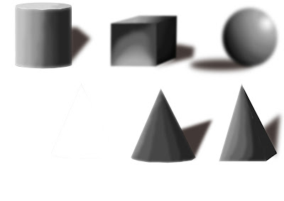
Tone referes to light and dark values used to highlight or define a piece of art. Adding tone to a piece of art can make the character, object or landscape stand out more and can be used to define certain areas of the image or even show light. Tone is particuly good at demonstrating light, for example; on a character its good to show where shading should be and define certain partsof the body. Tone is usualy demonstrated with a black pencil or pastel to capture the shading and define the light but you can also use a brown pastel or pencel too.
Aslo, Tone is very good for demonstrating contrast in an image, for example; on a piece of landscape art you would have the furthest away part in white and the closet part of the image in black because tone goes from pure black down to white. Bellow is my own demonstration of how the contrast of tone works starting from the lightest dark to pure black. 


Monday 1 October 2012

Concept Art Analysis:

This is what’s called an underlay, it's where the concept artist will take a picture of someone in a specific pose and draw over them with their own design. Then add in a real picture of a background to make the piece stand out and ultimately makes it easier to get a better idea of the design.
This would be done on on a computer using a software like Photoshop or illustrator. The way this sort of concept art is done makes it look like a real person and so you can really get a feel for what the concept artist is trying to create because of the amount of detail in. The colour palette is also quite realistic because it is from a picture and probably edited with a few effects. There is also a subtle tint of green in the background which adds a misty feel to the picture.


This is an example of a photorealistic design and you can see why because of the textures used and effect of hair on the chest and arms. Plus, there is also a shine to the character to suggest real life elements and it has a light effect coming from the left to highlight the texture of his skin and the hair on his arm, it is also to show tone and shading.

The colour pallet is very realistic in terms of skin colour and tone but also very dark and gritty by using reds and black. This piece of concept art is very good but I wouldn’t want to receive it as a reference to model because it isn’t the full picture of the character so it’s missing key modelling references. However, the design of the character is very detailed and you can really get a sense of what this character is like and what he has been through. For example; his broken horns and scares suggest that he’s not a nice person and has been in some fights. The artist has also paid a great amount of attention to the muscle on this character, especially round his neck and arms, you can see that the character is really tense and looks angry.