Wednesday, 19 December 2012

Using Perspective

                                                                   Perspective

One-point Perspective: 
One-point perspective is a technique of drawing that helps show objects and landscapes in a professional way. 1 point perspective uses lines that come from an object and converge together until they are one point which is called the vanishing point. The vanishing point in located on the horizon line which is used to show how fare away the the object is. An object or landscape made up of perpendicular lines parallel to each other can be demonstrated with one-point perspective.


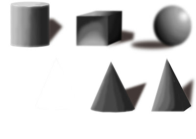
The example on the left is a bad example of one-point perspective because there are no visible vanishing points and is just a 3D shape.


Two-point Perspective:
Two-point perspective is very similar to one-point but is used for more for buildings. Instead of having one set of perpendicular lines leading to the vanishing point, there are two sets of lines coming of an object and going to opposite vanishing points. Two-point also has a horizon line. Two-point perspective is very good for capturing the angles of corners of houses and buildings.


Fibonacci Spiral/Composition:
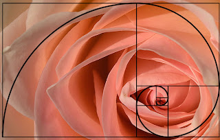
The Fibonacci spiral is a technique to make an image more visually pleasing to the audience. This technique work's because it is the perfect spiral and it makes your eye focus on the start of the spiral and then leads your eyes to the centre where the main focus of the image is. This technique is more practical than using the rule of thirds because it allows the audience to follow the spiral and look at all of the image instead of just making them go straight to the main focus on a image. The Fibonacci spiral works so well because it is divided into perfect squares so each corner of the squares works as a key point for the spiral. Alot of pictures use this technique so that the audience will focus into the picture key point slowely instead of going straight to it. The fibonacci sprial is used to draw way focus at first then spiraling you in to the main focus of the image. The fibonacci sprial uses the principal of Fibonacci's sequence, the fibonacci sequence is a series of perfect numbers that for the perfect spiral.

Tuesday, 4 December 2012

Enviroment Concept Art

This is my final concept art piece for my landscape design before adding colour.

Monday, 22 October 2012

Concept Art: Silhouettes

Concept Art: Silhouettes

When doing concept art creating a character from scratch can be difficult and frustrating. But there are techniques that can help make your designs more accurate and varied. The best technique is silhouetting, silhouettes are a very good way of getting the shape for your character and finding out what sort of character it is. It's a very simple technique which is best used on Photoshop because you can quickly sketch out shapes and rub them out. After a few trys you can start to see a character forming and from there you can just let your imagination run free. A lot of professional concept artists use this technique's to quickly get a few basic character structures and then pick the one they like and start adding detail, they then would give the silhouette sketches to a designer or 3D artist to model off.
The silhouettes need to be very strong and varied because when playing a game you need to be able to kow what that character is when you first see it. It's useful, when designing silhouettes, to make more than one and make each one different in shape and value and from that you can combine them, for example; if you like the arm on one character but like the rest of the body on another character you could simply combine them.
This method of drawing is brilliant for characters but for designing vehicals or objects it is very inpractical because you cant see the full design and you cant get the detail you need. Also, with objects and vehicals you need to be able to see the functionality of it.  

These are a couple of my own designes that i did at college.


Tuesday, 2 October 2012

Tone:

Tone referes to light and dark values used to highlight or define a piece of art. Adding tone to a piece of art can make the character, object or landscape stand out more and can be used to define certain areas of the image or even show light. Tone is particuly good at demonstrating light, for example; on a character its good to show where shading should be and define certain partsof the body. Tone is usualy demonstrated with a black pencil or pastel to capture the shading and define the light but you can also use a brown pastel or pencel too.
Aslo, Tone is very good for demonstrating contrast in an image, for example; on a piece of landscape art you would have the furthest away part in white and the closet part of the image in black because tone goes from pure black down to white. Bellow is my own demonstration of how the contrast of tone works starting from the lightest dark to pure black. 


Monday, 1 October 2012

Concept Art Analysis:

This is what’s called an underlay, it's where the concept artist will take a picture of someone in a specific pose and draw over them with their own design. Then add in a real picture of a background to make the piece stand out and ultimately makes it easier to get a better idea of the design.
This would be done on on a computer using a software like Photoshop or illustrator. The way this sort of concept art is done makes it look like a real person and so you can really get a feel for what the concept artist is trying to create because of the amount of detail in. The colour palette is also quite realistic because it is from a picture and probably edited with a few effects. There is also a subtle tint of green in the background which adds a misty feel to the picture.


This is an example of a photorealistic design and you can see why because of the textures used and effect of hair on the chest and arms. Plus, there is also a shine to the character to suggest real life elements and it has a light effect coming from the left to highlight the texture of his skin and the hair on his arm, it is also to show tone and shading.

The colour pallet is very realistic in terms of skin colour and tone but also very dark and gritty by using reds and black. This piece of concept art is very good but I wouldn’t want to receive it as a reference to model because it isn’t the full picture of the character so it’s missing key modelling references. However, the design of the character is very detailed and you can really get a sense of what this character is like and what he has been through. For example; his broken horns and scares suggest that he’s not a nice person and has been in some fights. The artist has also paid a great amount of attention to the muscle on this character, especially round his neck and arms, you can see that the character is really tense and looks angry.


Monday, 24 September 2012

Colour Theory

The basics of colour:

  • Red, blue and yellow are the the three primary colours.
  • The three secondary colours are orange, green and purple that come from mixing the three primary colours.
  • The opposites in a colour wheel are known as complimentary colours and the tend to be more vibrant and stand out more.
  • Analogue colours are colours that are next to each other in the wheel for example; blue, blue-green, green.
  • Red, yellow and orange are examples of warm colours.
  • Blue, green, and purple are examples of cold colours.
  • Red and green can be both warm and cold colours.
  • Hue is another word for colour.
  • Saturation is how intense the colour is.
  • Value is how light or dark the colour is.
  • Monochromatic is the same as hue but uses tints and shades to get different colours.
  • Equilateral triangle, yellow, blue and red are triads of colour.
  • Isosceles triangle is for split compliments.
  • Square is for complimentary colours combined with tertiary colours.


Colour palet for a game:


Monday, 17 September 2012

Visual Library

Visual Library

Visual Library is a mind tool that all artists and designers use in there work. It is essentially everything you have ever experienced and seen in your life that you can refer to when you are designing something. A visual library is very important for an artist because it allows them to create designs completely from there mind and through visual references, an artist with a good visual library will always be better than one who hasn't got a good visual library because they will be able to create more interesting and varied designs.
The best things to improve your visual library is, reading books, travelling, going to museums and observing nature. Reading is a very good way to build up your visual library because you are forced to imagine whats going on in the book and it sends you on a visual adventure. Travelling is also a good source of visual reference because you gain new incites to different cultures and learn about how other country's work, this is very useful if you are designing a village or a foreign character.
There are also things that can be bad for you visual library. Playing video games can be bad because its leaving nothing to your imagination so your not forced imagine. Fan art is also a bad source of visual reference because its not original and has been copied.


My summer project for improving my visuel library:


 -This is my first page of research for my design. I looked at alot of run down houses and japnese themes house and chose thes three to represent what i wanted.

-I also looked at a few cliffs and found this one that was exactly the type of cliff i was going for.


 -On this page i looked at more japonese themed enviroments, so i looked at some traditional trees and also some balconys because i wanted to add in more interesting things to the building.


-On the 3rd page of my research i started drawing ideas for what oarts of the house might look like. I started by drawing a thatched roof then drew some ideas for a window and the balcony for the front of the house. In the corner is the bonsai tree i put in in the final design.